
Case Study
Scroll down to view the creation of this magazine.
Research
To begin the process, as always, research came first. A lot of research was done firsthand by taking my experiences, coworkers, and bosses, and writing them down. From there, I began to search to find other magazines that focus on lifeguards. To my shock, there was a gaping hole in the market for a magazine that primarily focused on pool/water park guards, most focused on beach guarding. I decided to fill this gap and use the beach guard magazines as inspiration. They weren’t competitors, but rather cousins in the market, so I chose to use their successes to my advantage. I also ventured into surf magazines to find inspiration, as they would have a similar demographic as my magazine – aquatic teens and young adults.

Branding
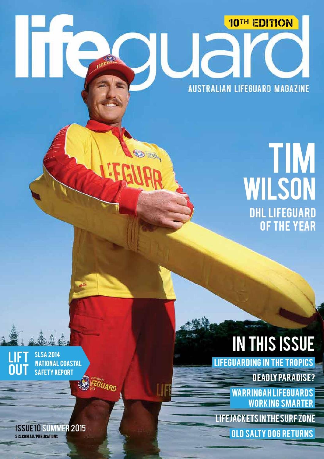
Branding went hand in hand with logo creation. When selecting colors, I wanted to keep in the common colors that go with the job: red for the guard suit, yellow for the rescue tube, and blue for the water. I wanted these colors to be bright and attractive but stay far away from the “caution” yellow or “danger” red. Once the logo color was decided, yellow became the primary color for the brand and its first edition. Keeping red and blue in the brand allows the opportunity for other editions to have flexibility, either being different colors for each edition or highlighting special editions.
To select the type for the magazine, I had to balance my desire to be youthful and dynamic with the need to accommodate text-heavy print reading. I chose a bold, uppercase-only header to keep it exciting but not take away from the serious nature of the topics in the magazine. My subhead and body copy is a serif, to allow the viewer to easily read the content.
Imagery and graphic choices were made with one thing in mind: to reflect the guards -- strong, bright, focused, and action-ready. I wanted to show guards in many ways: smiling, focused, moving, and celebrating successes. The yellow boxes and lines are there to highlight the messages behind the images.
Logo Creation
Creating the logo was different from others I had done in the past, as I wanted to make the text itself the logo and omit a mark – which was common in the magazines I had used as inspiration. I wanted the name of the magazine to convey lifeguarding without being painfully obvious. “Preserver” came from a long brainstorming process. Typically, Red is the color most associated with guards, but I wanted to show an understanding of the industry and opted for yellow, another color associated with lifeguards. The “V” being connected to the line above nods towards the heartline on hospital monitors, and the “+” in the “P” references the first aid symbol. The simple, dynamic logo reflects the job itself – simply sitting there on a stand until suddenly every second matters.


Layout and Planning
To keep the pacing, I had to plan not only the layout of the inner spreads of the magazine, but also the cover story, table of contents, and cover. I was careful not to create a layout that would take away from the stories but still create interest and excitement.


Photography and Writing
Being as personal as this project was, I chose to put a piece of myself into the work. I wrote a short piece about something no guard can function without – their eyes. I took my own perspective and put it into words and photographed real guards to send the message. I wanted to let these images speak volumes, so I included very minimal supporting graphic elements. Reflecting the humble subject matter discussed in the text, each eye’s owner is anonymous and yet watches with purpose.