Case Study
Scroll down to view the breakdown of this rebrand.
Research
I had to dig deep, reading article after article, to figure out what went wrong in the brand and how I could fix it with a rebrand. Long story short, the brand lost sight of its target audience along the road, and in a last-ditch effort they launched an ad campaign with “spongemonkies” -- that was the nail in the coffin. From this, I gathered that I needed to reestablish a target audience that would love what Quiznos made their name in – quality hot subs. I decided to focus my aim on a group of big eaters who need quality in a timely and budget-friendly manner: male college students.
Branding
To match the fresh quality of the ingredients the brand uses, and the youthfulness of the audience, I chose a bright color pallet with a soothing dark color to keep it away from being too childish. The supporting graphic elements are line art, matching the logo, and being simple while retaining the excitement of eating something delicious. Type is primarily sans serif, and when a serif is used, it is an organic friendly one – keeping a strong hierarchy and quality without being boring and old-fashioned.
As seen later in this case study, the copywriting matches the “bro” aesthetic of the audience: friendly, sarcastic, trendy, and funny. I wanted college men to relate to the brand, as they would be spending a lot of time here eating on campus between classes. It was important for me to make sure the brand didn’t lose credibility with this voice though, so the copy in serious matters – like the annual report-- is clever in more subtle ways.
Logo Creation
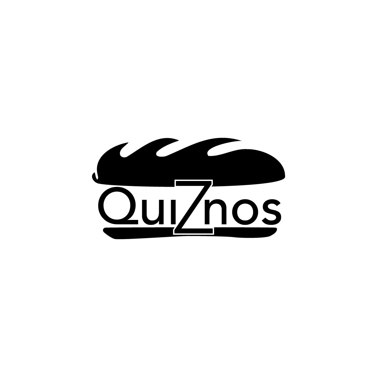
From my research, I decided a modern logo and branding was the approach I would take. I scrapped their dated logo entirely and started brainstorming things that go well with the brand and audience. Sandwiches and connections started to come to mind. I began sketching, trying to figure out how to combine these two concepts. Eventually, I realized college students connect to each other in a multitude of ways – speaking, social media, and texting. All of these can be shown with a speech bubble. Combining a speech bubble with a modern sandwich concept, I created their new logo.
Touch Points
The collateral is another extension of the rebrand, maintaining the refreshed look. By redesigning the uniforms, my goal was to uplift the workers and make them proud when they put them on. This goes into the to-go bag and cup, letting consumers carry their food with excitement rather than embarrassment. All collateral boldly displays the new logo to double as advertising for the new look and works towards creating brand recognition in the colors and pattern as well.
Annual Report
Finally, the annual report. This is where the creative copy gets a chance to shine in the professional sphere too. The new rebrand compliments the copy and encourages the viewer to read more. It helps investors in the brand see that they’re not just investing in a sandwich shop. They’re investing in the spot for young people to eat – bold, fun, and relevant. The color blocking works to establish hierarchy, the type enforces the new youthful approach to the audience, and the imagery confirms the quality that the brand was built upon.


